Design that communicates luxury Scope: Web Design and Development
The Challenge
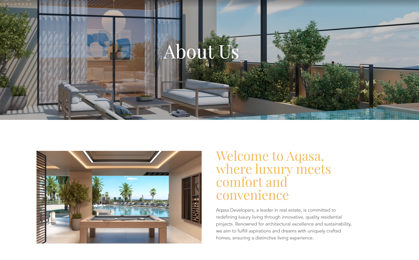
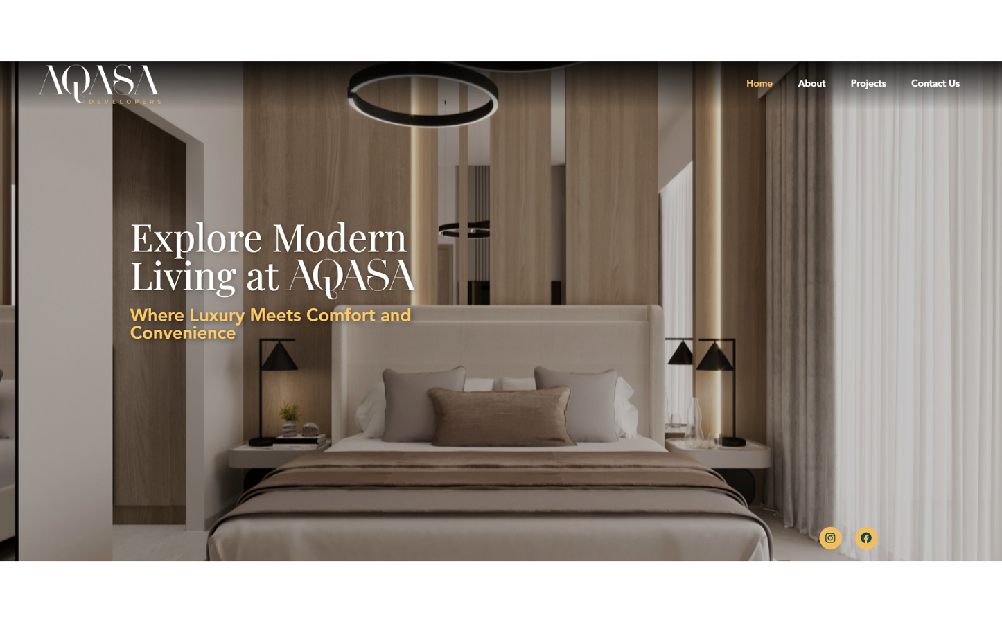
AQASA Developers came to us with a clear vision: a digital presence that matched the calibre of what they were building. High-net-worth buyers and international investors considering off-plan properties have a different set of expectations. They’re looking for stability, precision, and a developer they can trust. The brief was to build something that felt as considered and premium as the properties themselves.
Full design and development of a real estate site designed to reflect the quality of the developer behind it. Every decision, from layout to typography to how the property renders are framed, was made with one type of visitor in mind: someone who knows what they want and needs to feel confident they’ve found the right developer.
Visual Direction
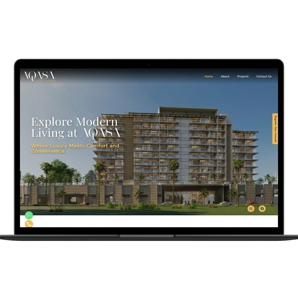
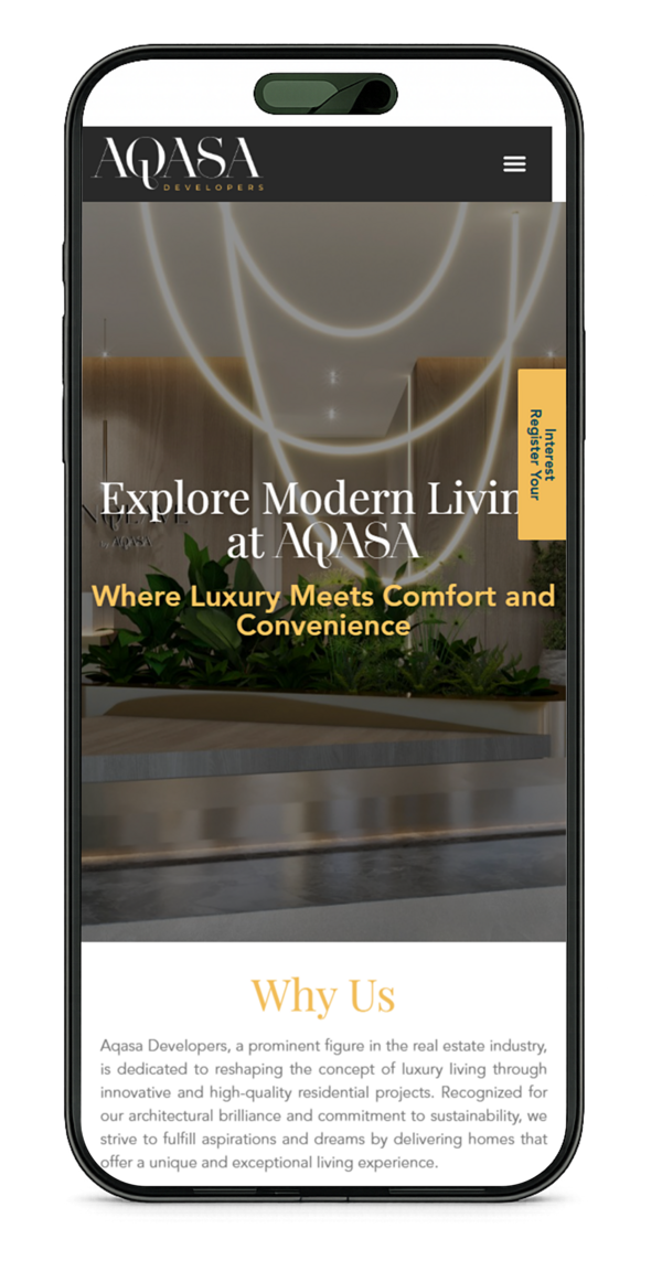
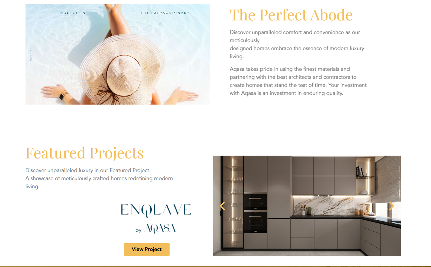
Beige, charcoal, off-white, and gold accents create a quiet luxury feel that steps back and lets the property renders take centre stage. Typography follows the same logic: clean, geometric, and precise. In a category where buyers are committing millions, the design signals that the developer is equally detail-oriented.
Conversion Architecture
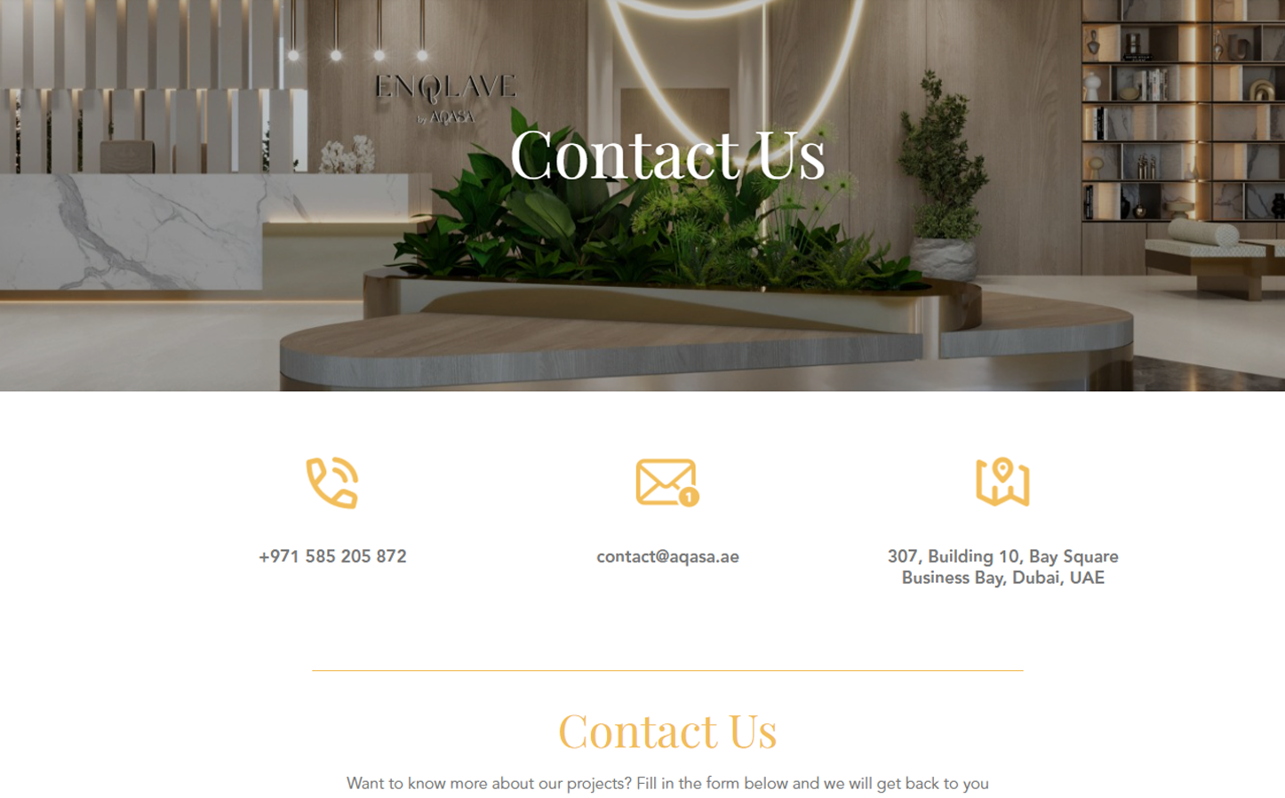
For a developer, the site’s primary job is lead capture. We kept forms short: name, email, phone. Register Your Interest CTAs remain accessible throughout the scroll without feeling intrusive. WhatsApp integration keeps the path to a human conversation short, which matters for international investors in different time zones.
Project Showcases and Trust
Off-plan buyers carry real anxiety about delivery timelines. Construction progress indicators, showing completion percentages per development, address that directly and visibly. Location context was built into the project pages to help investors unfamiliar with Dubai’s geography understand the value of each site relative to key districts.
What We Flagged
Two recommendations were submitted and not taken forward. An interactive floor plan selector within the site itself rather than routing users to a PDF brochure, which would reduce drop-off at a critical decision point. A live chat feature positioned as expert consultation rather than standard support, to improve conversion for first-time visitors who aren’t ready to fill out a form.
Get in touch
Reach out for projects, partnerships, or general inquiries.